Razer ID

UI/UX Case Study — End-to-End User Flow Redesign

Razer ID Cover Image

My Role

End-to-end UX designer for the duration of my internship at Razer Inc. I scoped the research, planned and facilitated all usability testing sessions across three iterative rounds, produced every design iteration, synthesised findings into design decisions, and presented the validated prototype to stakeholders. I was the sole designer on this project.

What I Noticed Before I Started Designing

+

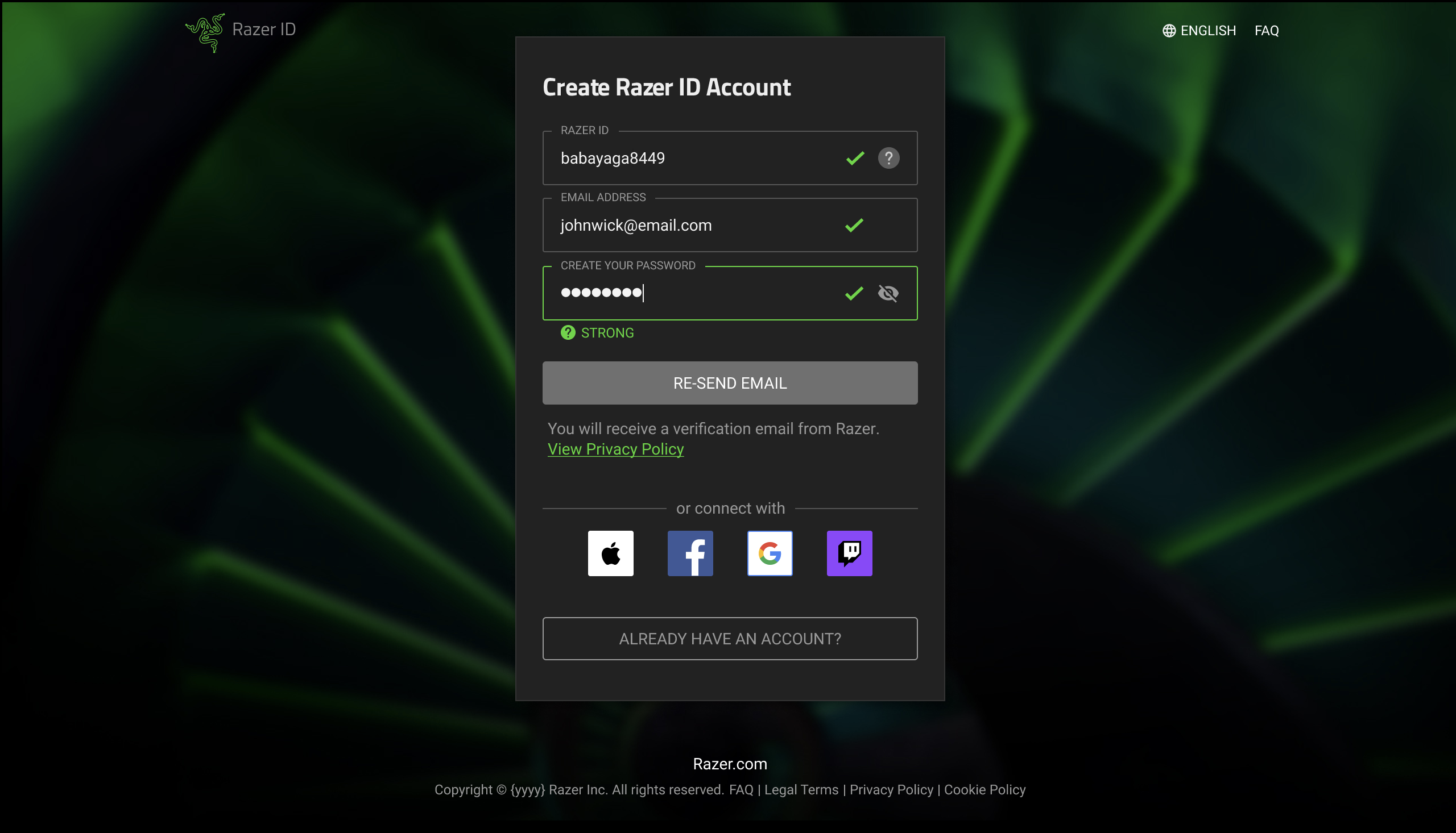
In my first week at Razer, I created my own Razer ID account. Before I had received a brief or opened Figma, I noticed something: I hesitated at the password creation step. I had not yet confirmed my email — I had not made any real commitment to the platform — and I was already being asked to invest effort in creating a password for an account I had not decided to complete. That moment of friction became the hypothesis I spent the internship testing: that the flow’s sequencing, not its visual design, was causing users to abandon.

Overview

+

Razer ID is the unified onboarding system used across Razer’s global product ecosystem — every device, every service, every purchase passes through it. Friction in the creation flow means fewer accounts completed, fewer users retained, and a first impression of the brand that works against everything downstream. Given a blue-sky brief, my goal was to identify the structural cause of that friction and redesign the flow to address it.

The Problem

+

The existing Razer ID creation flow placed too many decisions in front of users too early, creating unnecessary cognitive load at the point of first commitment. Drop-off and hesitation during the verification step indicated a structural problem with the flow’s sequencing — not just its visual design. A user who has not yet verified their email has no reason to invest effort in choosing a username and password. The flow was asking for commitment before establishing trust.

Research Approach

+

Rather than relying on a single user group, I planned and ran moderated usability testing sessions with participants drawn from five internal departments — marketing, HR, software development, and the UI/UX team — to surface a diverse range of mental models and expectations. Sessions combined qualitative observation with quantitative task-completion tracking, ensuring findings were both behaviourally grounded and defensible to stakeholders across three iterative rounds.

Key Insight

+

Users were most likely to abandon the flow when asked to create a username and password before their email had been verified. Resequencing these steps — asking for email first, completing verification, then proceeding to account setup — significantly reduced early friction and improved perceived clarity of the process. This became the structural principle that every subsequent design iteration built on.

The Decision That Changed Everything

+

After Round 1 testing, I made one structural call that shaped every iteration that followed: move email verification to Step 1, before any other account detail is requested. This was not a visual change — it was a sequencing change. The reasoning: a user who has verified their email has made a commitment. A user who has not has every reason to abandon. Every subsequent design approach I tested built on this resequencing. The question shifted from “should we resequence?” to “how do we best handle what comes after verification?”

Initial Wireframe Design for UT1 Iteractions

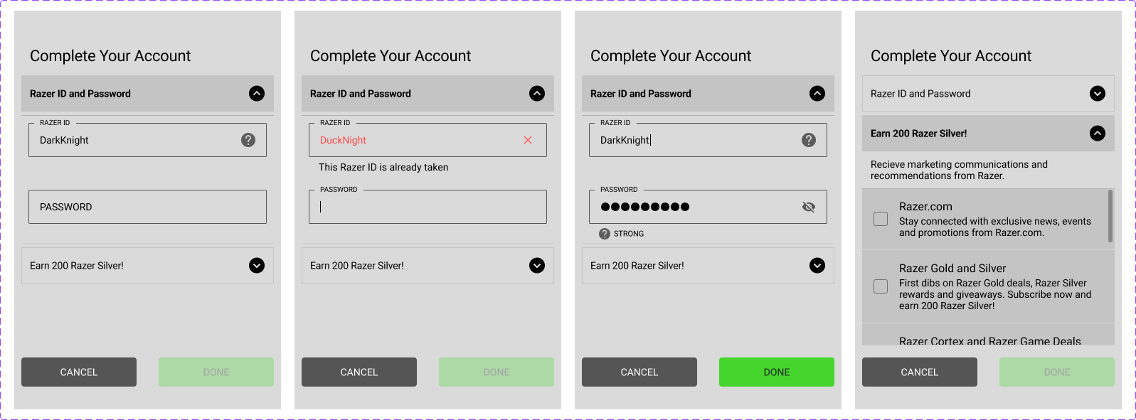
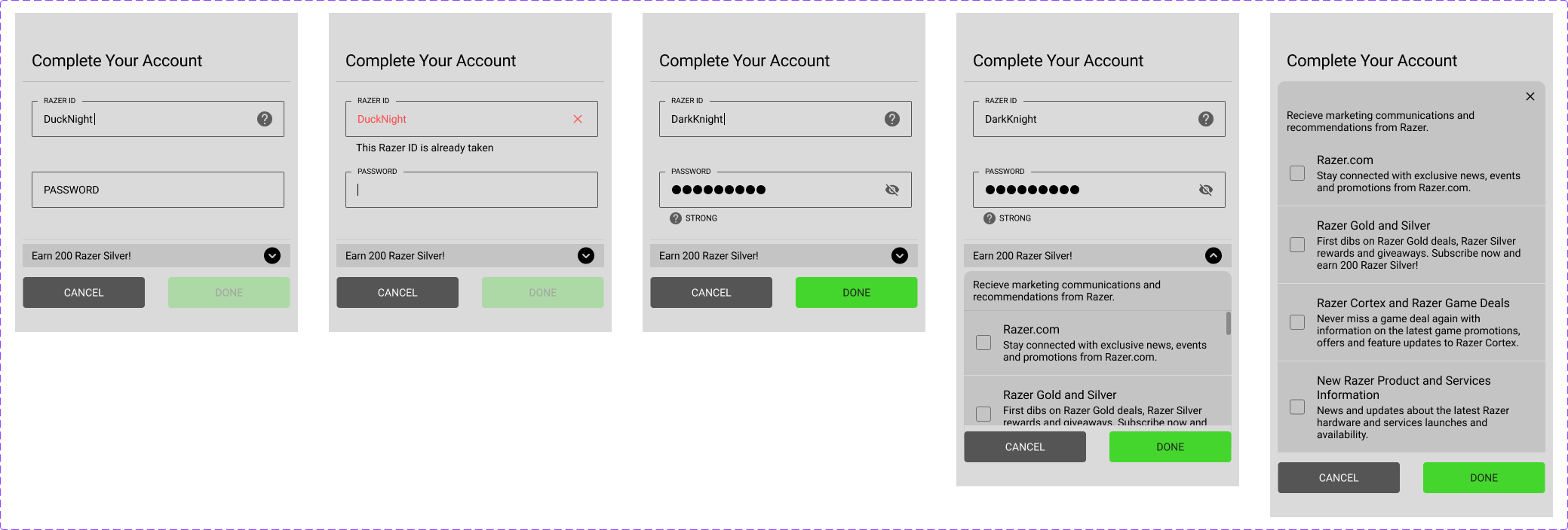
Before transitioning towards an “email-first” approach, these iterative wireframe explorations focused on reducing visual clutter and improving the overall account creation experience.

A key feature introduced was the automatic generation of a Razer ID upon user entry, reducing the number of decisions required during onboarding.

These iterations explore different approaches to progressive disclosure, aiming to improve clarity, minimise cognitive load, and create a more streamlined onboarding flow.

The initial usability testing findings indicated that the double-accordion approach provided a cleaner and more digestible experience, while also increasing the likelihood of users opting into Razer’s communication subscriptions.

Double Accordion Wireframe Design

Double Accordion Wireframe Design

Single Accordion Wireframe Design

Single Accordion Wireframe Design

Post UT1 Iterations

The following three screens illustrating the core design journey — from early experimentation to the final validated onboarding flow.

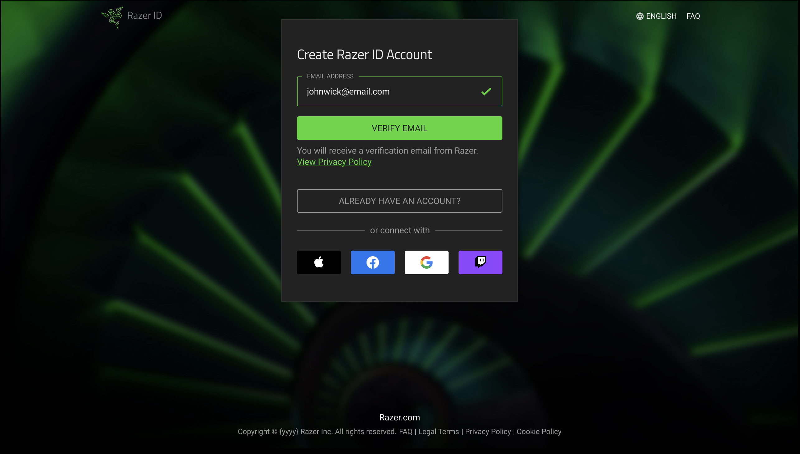
Further testing of the double-accordion design revealed that email verification needed to occur either before or after account setup. In response, Round 3 explored an “email-first” approach, removing the need for users to create an ID and password at the initial stage of account creation.

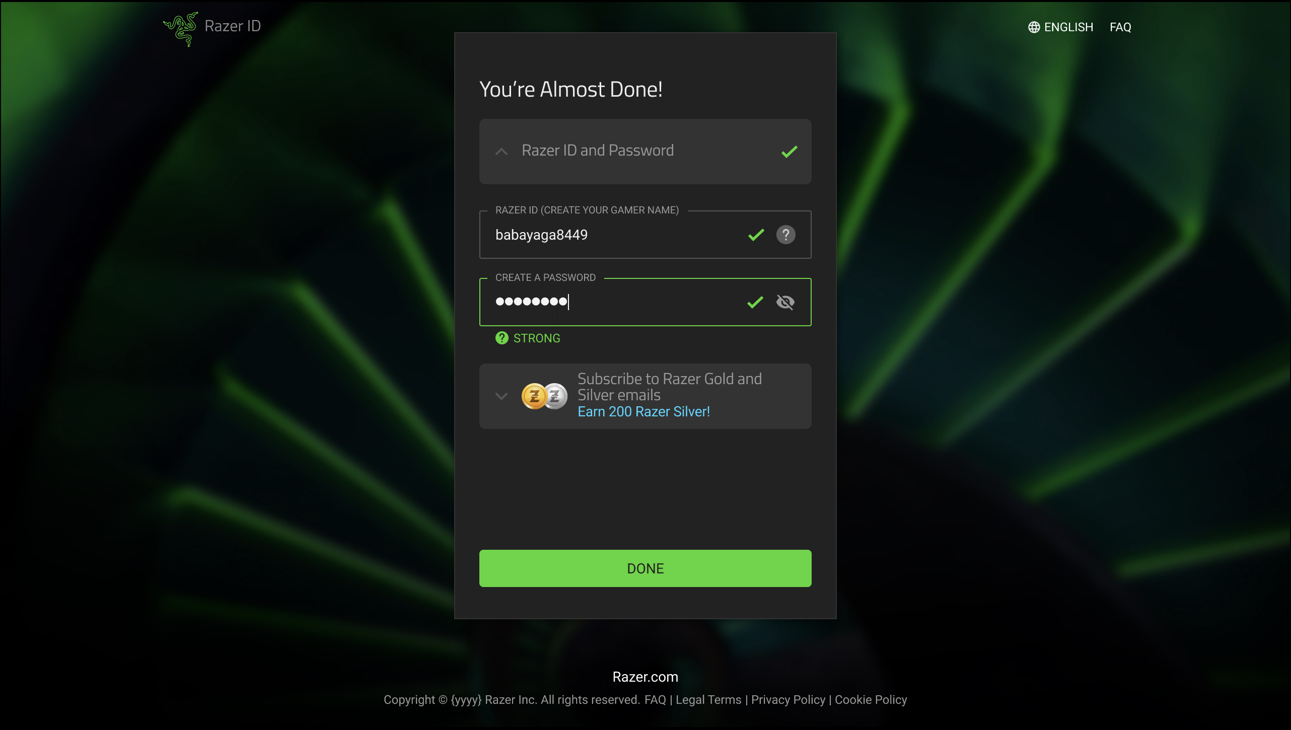
However, findings from Round 3 showed that users still expected an explicit ID and password setup step to feel confident that their account had been properly created. The final design therefore adopts a more balanced approach, prioritising account credential creation while positioning communication preferences as a secondary step.

Round 1 — Double Accordion layout. Early exploration of progressive disclosure. Users hesitated at accordion state changes, confirming the problem was sequencing rather than layout.

Round 1 — Double Accordion

Round 3 — Email-first flow. The key resequencing decision: email entry and verification as the sole first step, with no password requirement at sign-up.

Round 3 — Email-First, No Password

Final Design — Email verification step with auto-generated Razer ID suggestion. Account creation decoupled from marketing opt-in.

Final Design — Email Verification

This Figma prototype showcases the user flows explored during Round 2 of testing. Navigate through the different prototype options to see how participants interacted with and responded to each flow.

Expand the prototype to optimize your experience

Final Prototype

The final prototype reflects the validated flow: ID and password creation, in conjunction with email entry and verification as a dedicated first step, followed by the disclosure of optional fields (email subscriptions). The design reduces perceived commitment at the point of entry and guides users through a clear, paced sequence.

Expand the prototype to optimize your experience

Design Iterations & Testing

The design went through three structured rounds of iteration, each informed directly by usability findings:

  1. Round 1 — Accordion Layouts: Early experimentation with accordion-based progressive disclosure to test whether grouping related fields reduced the feeling of a long, overwhelming form. Users found the accordion transitions unfamiliar and hesitated at state changes. This round confirmed that the problem was sequencing, not layout.
  2. Round 2 — Flow Resequencing: Based on Round 1 findings, the flow was restructured to lead with email entry and verification before any account details were requested. This change addressed the root cause of early abandonment behaviour observed in testing and significantly improved user confidence in completing the flow.
  3. Round 3 — Parallel Concept Testing: Five alternative approaches were prototyped and tested side by side to converge on the optimal solution through evidence rather than preference:
    • Double accordion layout
    • Scrollable container design (version 1)
    • Scrollable container design (version 2)
    • Email verification as a standalone first step
    • Combined verification and user ID creation in a single step
    Testing identified the email-first, step-by-step flow as the clearest path across the broadest range of user types.

Outcome

+

The final prototype received stakeholder sign-off as the recommended direction for implementation. Usability testing demonstrated measurably reduced hesitation at the verification step compared to the original flow. The process established a reusable research-to-prototype framework applicable to future account flow improvements across the Razer ecosystem.

What I Would Measure in Production

+

Three metrics matter most for validating this design in a live environment: email verification completion rate at Step 1 — the primary indicator of whether reduced early friction is working; time-to-complete the full creation flow; and drop-off rate at the subscription step, to validate that decoupling account creation from marketing opt-in does not hurt subscription rates. If verification completion improves but subscription opt-in drops, the decoupling worked — and that is a separate problem to solve with better subscription value communication, not by re-coupling the flows.

×