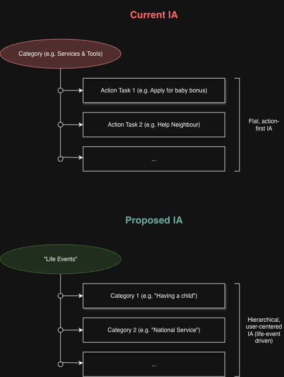
Key Observation — No Users Used the Search Bar
Across all three options, none of the participants used the search bar as their primary navigation method. This is a significant directional finding — it reinforces the core hypothesis that a life-event-based IA better serves low-intent users than a flat, task-oriented structure or search-first approach.
Table 1 — Happy Flow Summary
Whether each participant followed the intended navigation path through each option, and where they ended up.
| Option |
User |
Happy Flow? |
Where They Ended Up |
Option A
Editorial Curation |
User 1 |
No |
"Apply for Baby Bonus" — one task, not holistic discovery |
| User 2 |
Yes |
No specific endpoint — explored all options under "Having a child" chronologically |
| User 3 |
No |
"Child LifeSG Credits" from landing page shortcuts — bypassed life event tiles |
Option B
Self-Segmentation |
User 1 |
Yes |
"Support schemes and subsidies" |
| User 2 |
Yes |
No specific endpoint — explored all options under "Expecting a child" |
| User 3 |
Yes |
"Support schemes and subsidies" and "Programmes for first-time parents" |
Option C
Personalised Dashboard |
User 1 |
Yes |
"Support schemes and subsidies" |
| User 2 |
Partial |
"Register your child's birth" — selected wrong stage (below 12 months for pre-birth scenario) |
| User 3 |
Yes |
"Support schemes and subsidies" and "Programmes for first-time parents" |
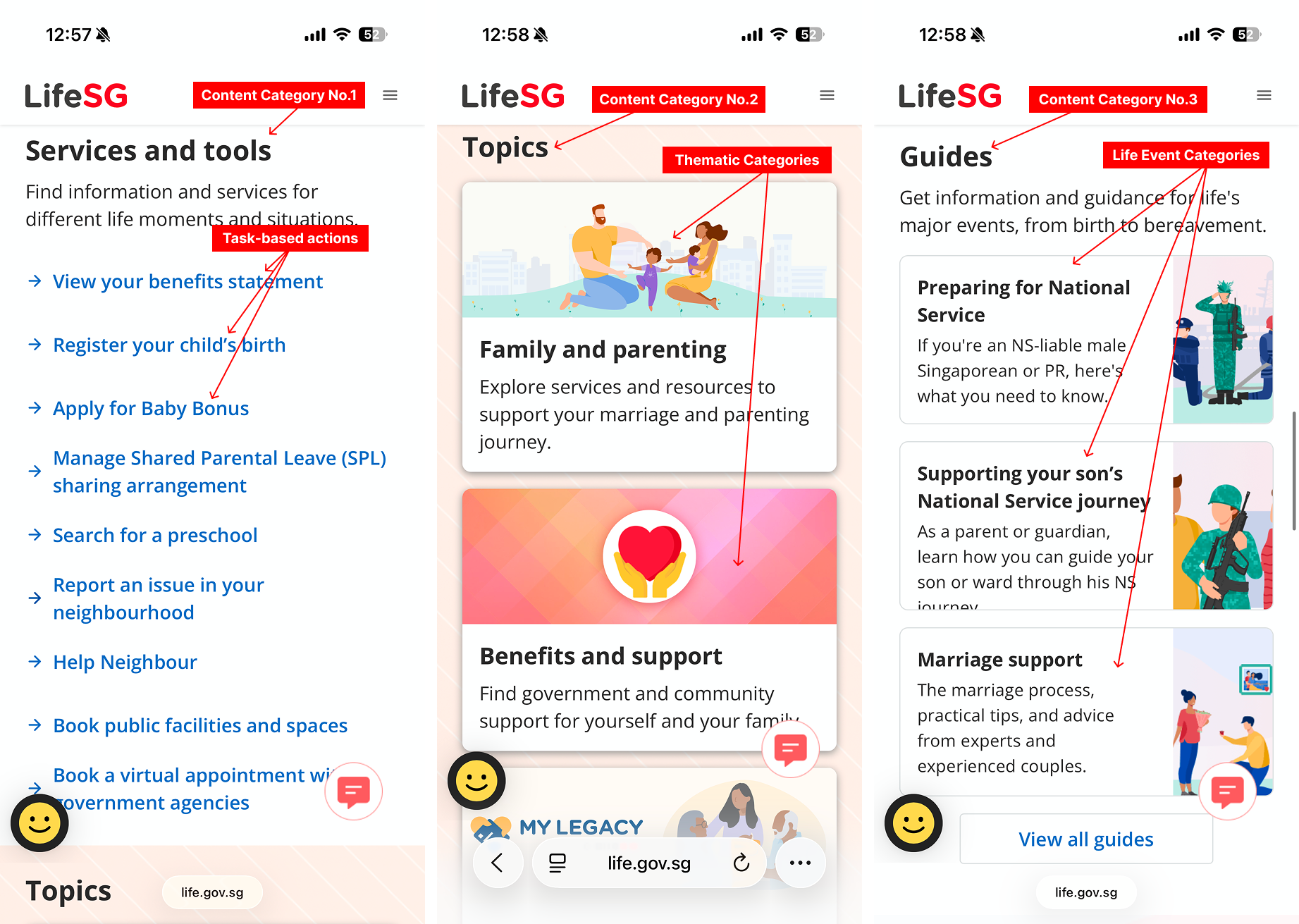
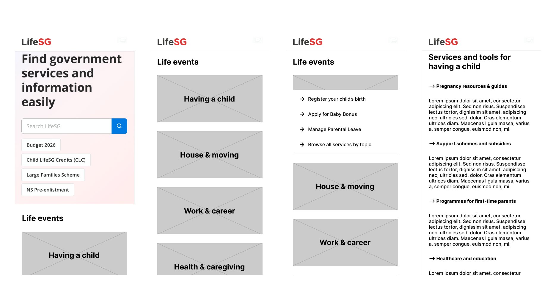
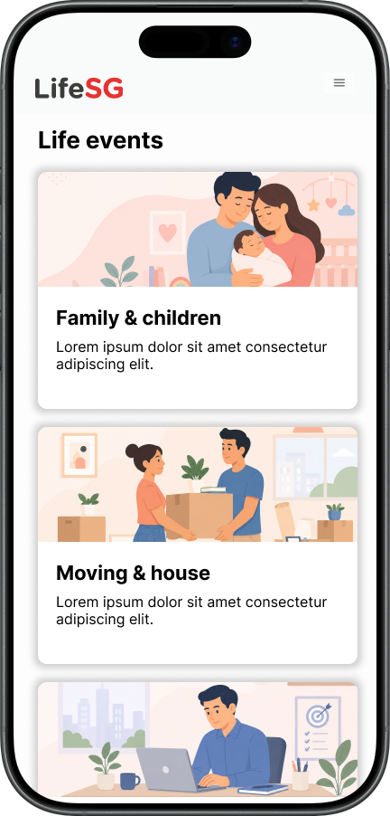
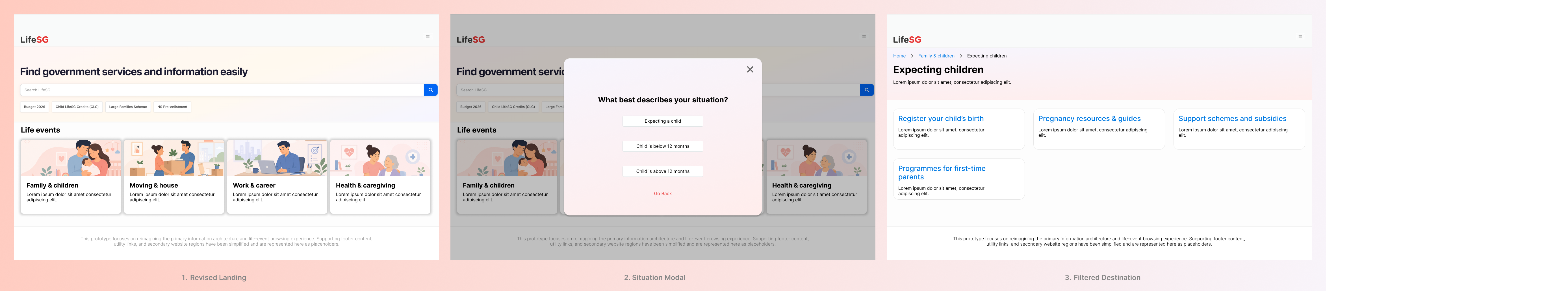
Option A — Editorial Curation
Option A produced the most varied behaviour. User 1 went straight to "Apply for Baby Bonus" — a single high-priority task rather than holistic discovery. User 2 deliberately swept through all options under "Having a child" in chronological order, preferring self-directed exploration. User 3 bypassed the life event tiles entirely and selected "Child LifeSG Credits" from the landing page, showing that prominent shortcuts can override the intended IA flow. Option A was described as "general" and requiring "trial and error." It demanded the most effort from two of three users — yet User 2 strongly preferred it for exactly this reason: it gave him freedom to explore without platform direction.
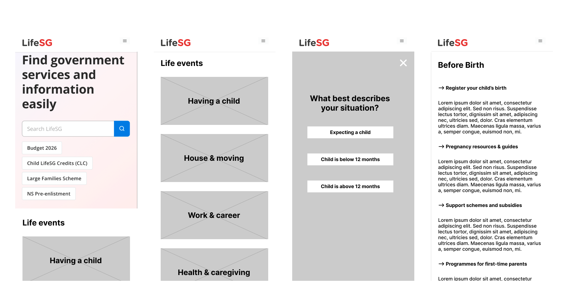
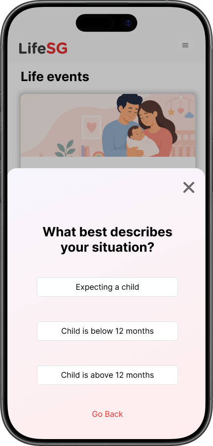
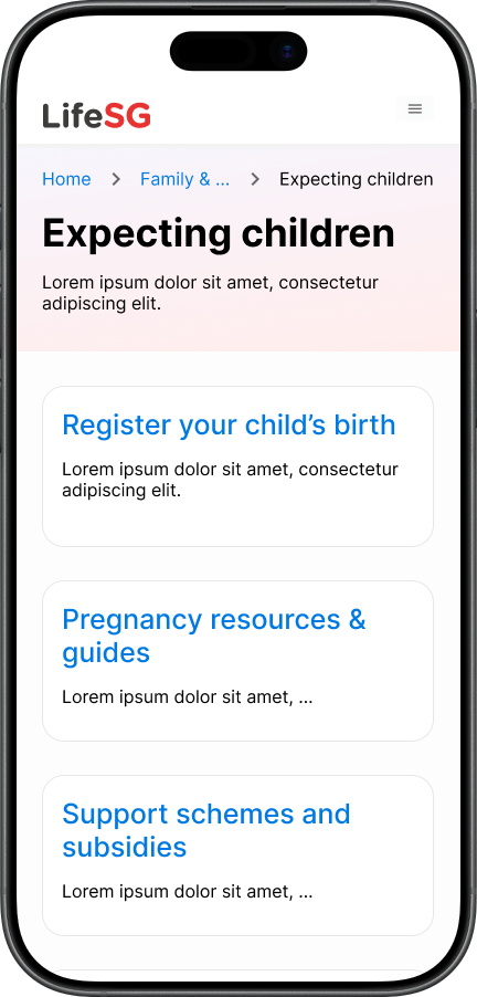
Option B — User Self-Segmentation
Option B produced the most consistent happy flows — all three users reached relevant content. Users 1 and 3 both landed on "Support schemes and subsidies" and "Programmes for first-time parents." User 2 completed the flow but found it "limiting" since it directed him to a single filtered page. Two of three users said Option B got them to relevant information fastest. No user felt the platform asked too much — one noted the questions felt purposeful rather than intrusive.
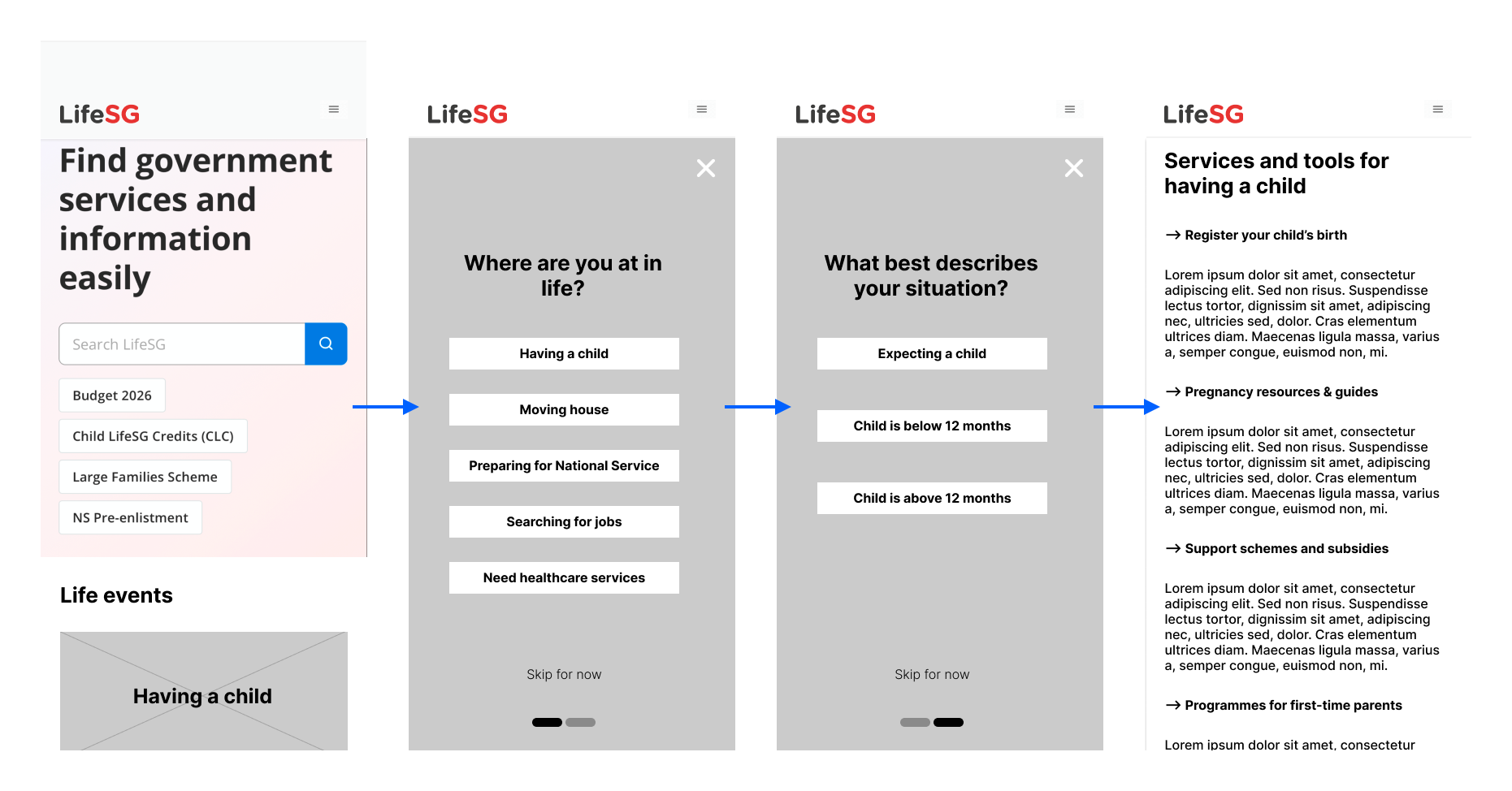
Option C — Personalised Life Stage Dashboard
Option C produced happy flows for all three users but revealed two notable friction points. User 2 tried to "swipe to the next page" on the modal — importing a native app gesture into a web context — and selected "Child is below 12 months" despite the pre-birth scenario, exposing an IA mismatch at the stage-selection step. He also expressed uncertainty about whether he could navigate back. Despite this, two of three users chose Option C as their overall preference, citing its directness: "just click, click, click." User 2 found the opening question unnecessary given his exploratory style.
Table 2 — User Preferences Summary
| User |
Preferred Option |
Fastest to Information |
Most Effort Required |
Reason for Preference |
| User 1 |
Option C |
Option C |
Option A |
Option A felt "general" — required guessing and trial-and-error |
| User 2 |
Option A |
Option B |
Option C |
Option A "brought me exactly where I want to go" and allowed free exploration |
| User 3 |
Option C |
Option B |
Option A |
Option C was most straightforward — "just click, click, click" |
Table 3 — Key Debrief Responses
| Question |
User 1 |
User 2 |
User 3 |
| Any moment of feeling lost? |
Option A felt too general — had to guess |
Unsure if he could "go back" in Option C |
No |
| How confident in the information found? |
"Ninety-nine percent" (referring to Option C) |
Confident across all three options |
Confident — options felt relevant |
| Did the app ask too much? |
No |
No — but preferred fewer questions; comfort with government context |
No — questions felt necessary to direct to the right page |
| Comfortable with information requested? |
Yes |
Yes — felt unnecessary but not uncomfortable |
Yes — not personal, just about life events |
What the Findings Mean for the Recommendation
The findings support the original recommendation against choosing a single pattern globally. Option B consistently guided users to relevant content most efficiently and produced happy flows for all three participants — making it the strongest default for life events with meaningful stage variance. Option A remains valuable for exploratory users and life events with a homogeneous action set. Option C's preference among two of three users suggests strong appeal, but the UI friction at the stage-selection step (swipe gesture assumption) and the IA mismatch (wrong stage selected for the scenario) indicate it requires more design iteration before being recommended as a primary pattern.
Note: With 3 participants this research is directional rather than conclusive. Findings identify patterns worth investigating but would require validation with a larger sample before informing production decisions.